Visual Identity on a Small Budget: What Actually Needs to Be Consistent
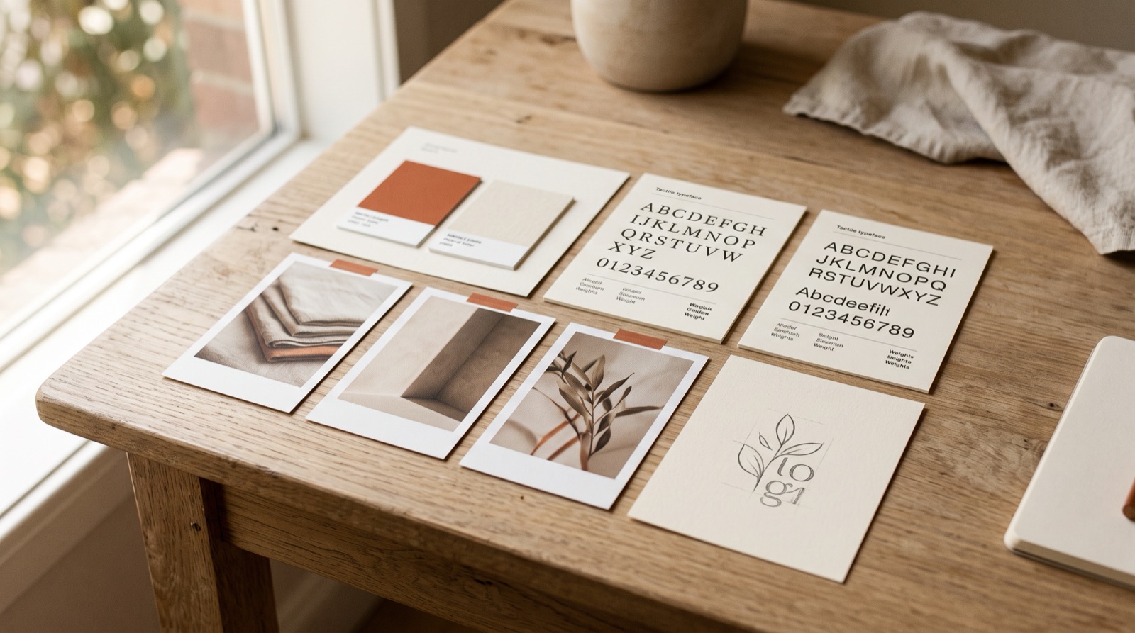
Ask a small-business owner about their visual identity and the conversation goes straight to the logo — how much it cost, whether it’s time for a new one. But your logo is probably the least-examined thing you publish. What people actually see, hundreds of times a year, is a post at thumbnail size moving past their thumb at scroll speed.
So here’s the test that matters: if we covered your name, would a follower still know a post was yours? Visual identity is a recognition system. The goal is to be recognized before the name is read. Everything below is in service of that — and none of it requires a big budget. It requires decisions, made once, kept ruthlessly.
The minimum viable identity kit
Four decisions. That’s the whole kit.
One primary colour, one accent — used everywhere
Not a palette of six. One colour that owns your brand, one accent for contrast, applied to every post, sign, and document without exception. Restraint is what creates recognition, not spend: a single colour repeated two hundred times beats six colours rotated tastefully.
Two typefaces, with clear jobs
One for headlines, one for everything else — and write the roles down. A third font isn’t an option; it’s a decision someone will make differently every time, and each improvisation chips away at the pattern people were starting to learn.
A photo style, not a camera
Lighting and tone matter far more than gear. Phone photos shot in the same kind of light and edited the same way every time will build recognition; a beautiful professional shoot mixed into a feed of random snaps won’t. Pick your light (bright and airy, or warm and moody), pick one editing treatment, and stop negotiating with yourself per post.
Logo variations for the places it actually lives
Your logo lives in a profile circle, a page header, a favicon, and maybe a storefront sign — four very different sizes and shapes. A detailed logo dies at 40 pixels. You need a simplified mark for small placements, and you need the files exported before the day someone asks for them.
Where consistency pays first
If you can only enforce the system in a few places, enforce it here:
- The social feed grid. Nine recent posts, seen in one glance, is your storefront window. This is where the covered-name test is passed or failed.
- Packaging and signage. Physical encounters repeat with the same customers — repetition is the whole mechanism.
- Proposals and invoices. The identity should keep working while money changes hands, not dissolve into a default Word template at the exact moment trust matters.
- Email. Header, colours, sign-off. Low effort, high frequency.
The mistakes that erase recognition
We see the same four constantly: a different template every post, because novelty feels like effort. Five fonts, because each new graphic invited a new choice. A logo too intricate to survive small sizes, so it gets inconsistently cropped instead. And the most expensive one — the trend-chasing rebrand. Aesthetic consistency compounds; it’s the same lesson we pulled from our Aritzia teardown, where a feed reads as one continuous visual system you’d recognize without the handle. A refresh every eighteen months resets that meter to zero and hands the compounding back.
Put the system on one page
Colours with hex codes. Both typefaces and their roles. Three or four photo do/don’t examples. Logo files listed by placement. One line on what never happens (“we never put text over faces”). That’s the entire document — the same logic as a one-page brand voice guide, applied to visuals. Now any freelancer, staff member, or Canva session produces on-brand work without you in the room.
The bilingual layer
For many Vancouver businesses, the identity has to work in English and Chinese — and this is where DIY systems quietly break. Your Latin typeface has no Chinese companion by default; choose a pairing that matches its weight and mood, or the two languages will look like two brands. And Chinese is denser: the same message takes fewer characters carrying more visual weight each, so a layout sized for an English sentence can feel empty or cramped in translation. Test every template with both languages before you lock it.
Want an identity kit your whole team can actually follow? Email Charlene and we’ll build the one-pager with you.
Frequently Asked Questions
Does a small business need a full brand guideline document?
No. A one-page visual cheat sheet — colours with hex codes, two typefaces with assigned roles, a few photo do/don't examples, and logo files by placement — covers what a small business actually publishes. Full brand books are for organizations with many hands producing content; for a small team, a page that gets used beats a book that gets admired.
How many colours and fonts should a small business use?
One primary colour plus one accent, and two typefaces at most — one for headlines, one for everything else. Recognition comes from repetition, and repetition is only possible when the system is small enough to apply without thinking. Every added colour or font multiplies the ways your content can drift.
When should a small business hire a designer instead of doing it themselves?
Hire for the one-time foundations: the logo and its variations, the colour and type choices, and the cheat sheet itself. Daily execution — posts, stories, menus, invoices — is discipline, not talent, and a good system makes it DIY-able. The expensive mistake is the reverse: paying for design monthly while owning no system.
Keep reading

Get in touch