Teardown: How TELUS Kept the Same Critters for a Quarter Century
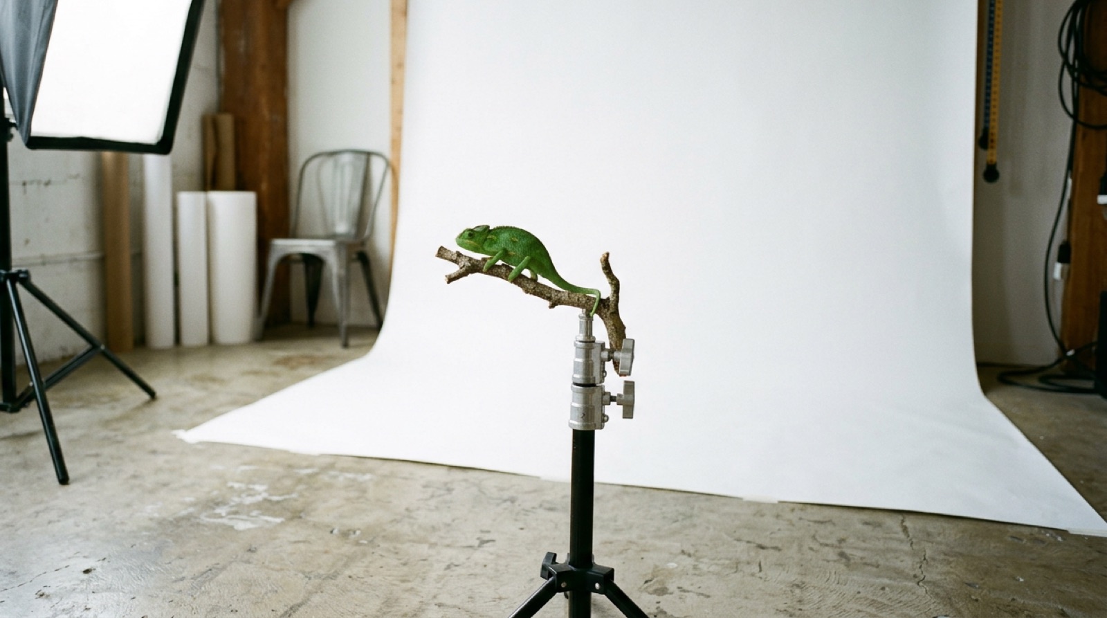
Cover the logo on a TELUS ad and you can probably still tell whose ad it is.
That is not just our impression; it is the point. In a 2020 Strategy column, CEO Darren Entwistle is cited making exactly that claim: people recognize a TELUS ad without seeing the logo. Very few brands in any category can say that, and almost none of them got there by accident.
What makes the TELUS story worth studying is not just the consistency. It is that the critters did not start at TELUS at all.
The usual disclosure: TELUS is not a Kuipra client. This is an outside teardown built from trade press, a published awards case study and the company’s own announcements.
The facts. TELUS is headquartered at TELUS Garden on West Georgia Street in Vancouver. The animals-on-white look began in 1997 with Clearnet, a wireless competitor, and its agency, Taxi. According to Strategy, Taxi’s Jane Hope and Paul Lavoie took the nature idea from Microcosmos, a 1996 film about insects, and Hope chose plain white backgrounds because she liked a Japanese aesthetic. The film’s director shot the launch spots. Clearnet launched with the line “the future is friendly,” and its 2001 CASSIES case explains the flora-and-fauna imagery was meant to ease people’s discomfort with new technology.
The buyer adopted the brand it bought
In 2000, TELUS acquired Clearnet. Normally the buyer’s brand swallows the target’s. This time it went the other way.
The CASSIES case puts it plainly: “Telus has adopted ‘the future is friendly’ as its corporate brand position.” TELUS took on Clearnet’s colours, typography, imagery and tone. Strategy columnist Will Novosedlik calls it a “reverse brand take-over”: TELUS kept its name and logo, and almost everything else came from the company it bought.
This is the hardest kind of brand decision, because it requires putting customer recognition ahead of ego. Most acquirers, and most new owners of small businesses, want to put their stamp on things. The better question is which brand customers already like, and how much of it you can keep. Our rebrand timing guide walks through how to tell when a change is genuinely needed.
It is a frame, not a mascot
People call them “the critters,” but the asset is not any one animal. It is a system:
- A subject from nature, different almost every time.
- A plain white background, every time.
- Bright colour against that white.
- A friendly, slightly playful tone.
Because the frame is fixed and the subject changes, the work never feels stale and never feels like someone else’s. The CASSIES case had a name for this approach: familiar but fresh.
That is the most useful idea in this teardown for a small business. You do not need a mascot or a jingle. You need a frame you can repeat: the same backdrop for product photos, the same angle and light for your before-and-after shots, the same layout for your social posts. Then you change what goes inside it. Our visual identity guide covers which elements are worth locking down first.
It survived everything that usually kills a brand platform
Brand platforms tend to die at predictable moments: a new agency, a new marketing head, a new strategy. The critters have been through all of them.
- A new agency. Taxi held the account for almost 18 years before The&Partnership became creative agency of record in 2014, according to Strategy. The critters stayed.
- More agencies. In 2017 The&Partnership and Cossette formed a joint team for TELUS, and in 2023 TELUS added Rethink, Carat and Hogarth to its roster, with The&Partnership keeping the masterbrand.
- A detour, and a return. In March 2023, Strategy described a new critter campaign as a recommitment to the mascots after they had been left out of a campaign about the company’s environmental and social work.
- New production technology. In December 2025, a Google Pixel 10 campaign with TELUS used AI-generated critters, and TELUS said the critters had been at the heart of its brand for 25 years.
The lesson is not that TELUS never wavered. It did, at least once. The lesson is that the system was clear enough that people could tell when it was missing, and bring it back.
In the same Strategy column, Denise Bombier of TELUS brand marketing makes the practical case: when customers already know you, you do not have to keep reintroducing yourself. Every ad builds on the last one instead of starting from zero.
Refresh the frame, do not replace it
In March 2021, TELUS updated its brand promise from “the future is friendly” to “let’s make the future friendly.”
Look at what changed and what did not. According to Campaign Canada, the critters became more natural and authentic, Canadian wildlife such as a lynx and a black bear joined the cast, pink joined the purple and green, and a new typeface came in. The white frame, the animals and the friendly tone all stayed. TELUS’s Jill Schnarr told the publication they never considered moving away from the platform because of the goodwill it had built.
That is what a good refresh looks like: modernize the details, keep everything customers recognize.
Brand over price, in a category where everyone sells the same thing
Wireless service is close to a commodity. Most providers sell similar plans at similar prices, which pushes everyone towards price promotions.
According to its CASSIES case, Clearnet deliberately chose brand-building over price-led promotion. The case reports that between Q3 1999 and Q3 2000, Clearnet’s subscriber base grew 51%, against 27% for Bell Mobility and 18% for Rogers Cantel, and the work won two Gold awards. The case is also honest about its limits: no brand research was run in that period, and its editor notes that strict cause and effect is hard to prove.
So treat it as a strong signal, not proof. But the logic will be familiar to any small business in a crowded category, whether that is plumbing, dentistry or coffee: if what you sell looks the same as everyone else’s, how you show up becomes the difference.
TELUS has also put its name on other people’s brands. For fifteen years it held naming rights to Science World, which we covered in the Science World teardown.
Three moves you can steal at any size
Pick a frame you could repeat for ten years. One background, one colour, one composition, one tone. Choose something simple enough that a new staff member or a new designer can follow it without you in the room.
Change what goes inside the frame, not the frame. New products, new seasons and new offers go inside. The frame stays. That is how you get “familiar but fresh” on a small-business budget.
Write it down so it survives people. TELUS’s system outlived its original agency and several marketing leaders because it was clear enough to hand over. A one-page guide does the same job for a small team; our brand voice guide shows how to write one.
The critters are almost thirty years old, older than many of TELUS’s customers. They have lasted because nobody had to reinvent them, only look after them.
If you want help finding the frame your business could own for the next decade, that is the work our brand strategy service does. Or use the form below to tell us about your business.
Frequently Asked Questions
Where did the TELUS critters come from?
From Clearnet, a wireless company that launched its PCS service in 1997 with the agency Taxi. According to a 2020 Strategy column, Taxi's Jane Hope and Paul Lavoie drew the nature idea from the 1996 insect film Microcosmos, and Hope set the animals on white because she liked a Japanese aesthetic. TELUS acquired Clearnet in 2000 and adopted the look.
Did TELUS change its slogan?
Yes, slightly. In March 2021 "the future is friendly" became "let's make the future friendly." The critters stayed, but were shown in a more natural way, with Canadian wildlife such as a lynx and a black bear, a pink added to the purple and green palette, and a new typeface.
Is there evidence the critter campaign worked?
The best public evidence is a 2001 CASSIES case for Clearnet, which won two Gold awards. It reports Clearnet's subscriber base grew 51% between Q3 1999 and Q3 2000, against 27% for Bell Mobility and 18% for Rogers Cantel. The case itself cautions that no brand research was run in that period and that strict cause and effect is hard to prove.
Keep reading



Get in touch